
In FakeChat Fun generator, you can customize the appearance of your screenshot down to the smallest detail: choose a messenger, switch themes, upload custom backgrounds, or change colors with Color Picker. This guide covers all customization tools to make your chat unique.
Selecting a Messenger
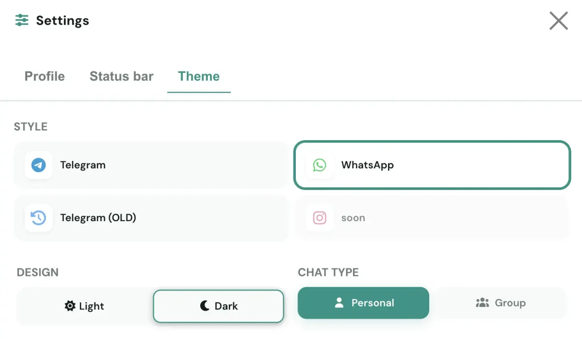
In FakeChat Fun, you can switch screenshot designs in one click between three platforms. This allows you to adapt the appearance to any task. Messenger choice also affects available profile settings—read more in our profile setup guide. Explore the full set of generator capabilities in our feature grid on the homepage.
Telegram
Modern Telegram design featuring round avatars, smooth bubble corners, and signature blue accents.
Original WhatsApp style with signature green chat bubbles, square avatars, and recognizable UI.
Telegram Legacy
Classic Telegram version with earlier interface design—ideal for retro aesthetics or older app versions.
Light and Dark Themes
Choose between two display modes depending on the visual style needed for your screenshot.
Light Theme
Classic light interface with a white background and dark text. Suitable for most use cases and familiar to users.
Dark Theme
Night mode with a dark background and light text. Reduces eye strain, looks modern and stylish—great for evening screenshots or social media content.
Input Field Placeholder Text
In FakeChat Fun, you can edit the placeholder text in the message input field. By default, it displays standard prompts: "Message" (Telegram) or "Message" (WhatsApp). You can replace this text with custom phrases like "Write something...", "Type a message", or any custom text.
Chat Background
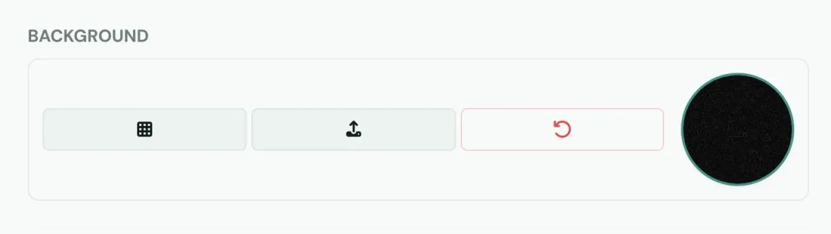
Chat background is a key element for screenshot authenticity. FakeChat Fun offers three background setup methods. After setting up your background, you can download the finished screenshot with your selected design.
Customizing Colors (Color Picker)
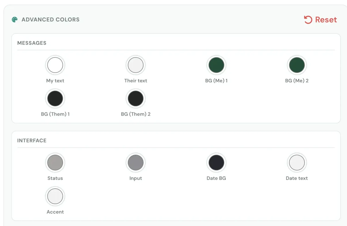
Color Picker lets you change the color of any interface element via color swatches. All elements are grouped into four categories. Message colors configured here apply to created messages in real time.
Messages
My Text
Background and text color for your messages. Configured independently to highlight your lines.
Their Text
Background and text color for the recipient's messages. Use distinct shades to separate sides of the dialogue.
Background (Me) 1
First background option for your messages. Use for variety or alternative styling.
Background (Me) 2
Second background option for your messages. Switch between variants for different chat scenarios.
Background (Them) 1
First background option for recipient's messages. Adjust for contrast against your messages.
Background (Them) 2
Second background option for recipient's messages. Great for creating varied visual scenarios.
Interface
Status
Text color for online activity status: "online", "last seen recently", "typing...".
Accent
Color for UI accent elements—icons, toggles, and active highlights.
Input
Background color of the message input field. Emphasizes the text box area.
Date Background
Background color of date badges between messages ("Today", "May 12").
Date Text
Text color on date badges. Choose contrasting shades for optimal readability.
Input Text
Placeholder text color in the message input field. Muted yet readable against the input box.
Time
Time (Me)
Timestamp color for your messages. Adjust transparency or shade for a subtle look.
Time (Them)
Timestamp color for recipient's messages. Configure separately for contrast.
Sticker
Color scheme for stickers—affects borders and surrounding outlines.
Call
Color scheme for audio and video call cards, including icons and call status.
Message Reactions
Message Reactions
Background and border colors for emoji reactions under messages. Adjust for best contrast.
Typography
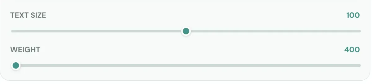
Typography tools help adapt message text to any screen resolution, ensuring maximum legibility and aesthetic appeal.
Text Size
Adjust message font size using the slider. Increase font size for mobile readability or decrease for a compact view.
Font Weight
Adjust font weight from thin to bold. Bolder text appears confident, while lighter text looks sleek and minimal.